Why 55K Developers Starred a Diagram Styling Tool
AI coding assistants excel at generating diagrams quickly, but they default to generic rounded-box styles that don't match your brand. Diagram Design solves the friction between AI speed and visual consistency—offering editorial-quality output without manual cleanup in Figma. We examine why this problem resonated with 55,000 developers and how the tool addresses the gap between Mermaid's version-control strengths and presentation-ready design.
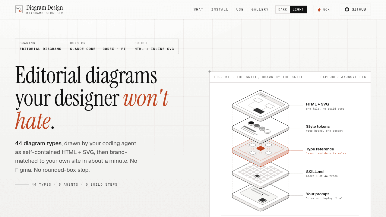
Claude generates a system architecture diagram in seconds. Then you spend thirty minutes in Figma adjusting rounded corners, swapping colors, and tweaking fonts so it doesn't look like every other AI-generated diagram on the internet. The maintainer of Diagram Design built the tool because Claude kept producing generic rounded-box diagrams that clashed with her blog's visual style—forcing a choice between accepting generic output or abandoning the diagram entirely.
The efficiency-design gap in AI diagrams
AI coding assistants excel at generating Mermaid syntax. Ask Claude or Cursor for a database schema or deployment flow, and you'll get clean, version-controllable markup instantly. Mermaid lives in your repository, updates with your code, and integrates into CI/CD pipelines without image files cluttering your docs folder.
The friction appears when those diagrams leave the engineering team. Developers report moving AI-generated diagrams into draw.io or Lucidchart when they need presentation-quality layout for blog posts, marketing documentation, or client-facing architecture reviews. Mermaid optimizes for automation and text diffing; branded content requires visual consistency that matches typography, spacing, and color systems the rest of your materials already use.
One limitation compounds the problem: coding models generate Mermaid readily but struggle with editable Excalidraw-style output. The gap isn't a flaw in the models—it reflects what formats they've been trained to produce. Developers who want hand-drawn aesthetics or fine-grained layout control hit a workflow wall.
What Diagram Design actually solves
Diagram Design sits between AI generation speed and editorial-quality visuals. It takes structured diagram data and renders output that matches your brand without requiring manual cleanup in a separate design tool. The value proposition is narrow: if you publish content where visual consistency matters—technical blog posts, open-source project documentation, developer marketing—the tool addresses a specific friction point.
This isn't a Mermaid replacement. Mermaid's strength is version control and automation; Diagram Design targets the moment you need that diagram to look like it belongs in your branded materials. It's complementary, not competitive. Lucidchart and draw.io serve teams that build diagrams from scratch or need collaboration features.
Why 55K stars and GitHub Trending #1
The repository hit number one on GitHub Trending. That velocity suggests the pain point resonates. Developer bloggers, technical writers, and engineering teams publishing external-facing content all encounter the same workflow gap: AI tools generate diagrams faster than humans, but generic output signals low effort in contexts where polish matters.
The star count validates that visual consistency is part of professional output quality, not vanity. When your architecture diagram uses different fonts and colors than your documentation site, readers notice. When every diagram in a blog post looks identical to every other Claude-generated example on the internet, it undermines the authority you're building through the content itself.
Growing pains: hard-coded palettes and customization
An open issue reports that hard-coded default palette values and font families can break custom-brand styling, including degraded zone-label opacity on lighter backgrounds. This is expected tension for a young project: opinionated defaults deliver "works out of the box" simplicity, but teams with established design systems need override control.
The challenge is typical for open-source tools finding their footing—how much customization to expose without sacrificing the ease that made the tool appealing initially. With the repository's growth, watching how the maintainer balances these competing needs will show whether Diagram Design evolves toward flexible theming or doubles down on curated aesthetic opinions.
Who should care about this tool
If your diagrams live in CI/CD pipelines and never leave engineering Slack channels, Mermaid already solves your problem. If you publish content where readers see your diagrams alongside your brand's typography and color palette—blog posts, public documentation, conference talks—Diagram Design addresses a workflow gap. No judgment on tools; just different fits for different contexts.
cathrynlavery/diagram-design
Editorial diagram design for Claude Code, Codex, GitHub Copilot, Cursor, Factory Droid, and Pi. 44 diagram types. Self-contained HTML + SVG. No shadows. No Mermaid slop.